A paramount aspect for any B2B ecommerce business which strives to succeed in an increasingly competitive market is having a responsive website design. One of Cloudfy’s key features is the flexible, responsive design available for the websites which are built using this cloud ecommerce platform.
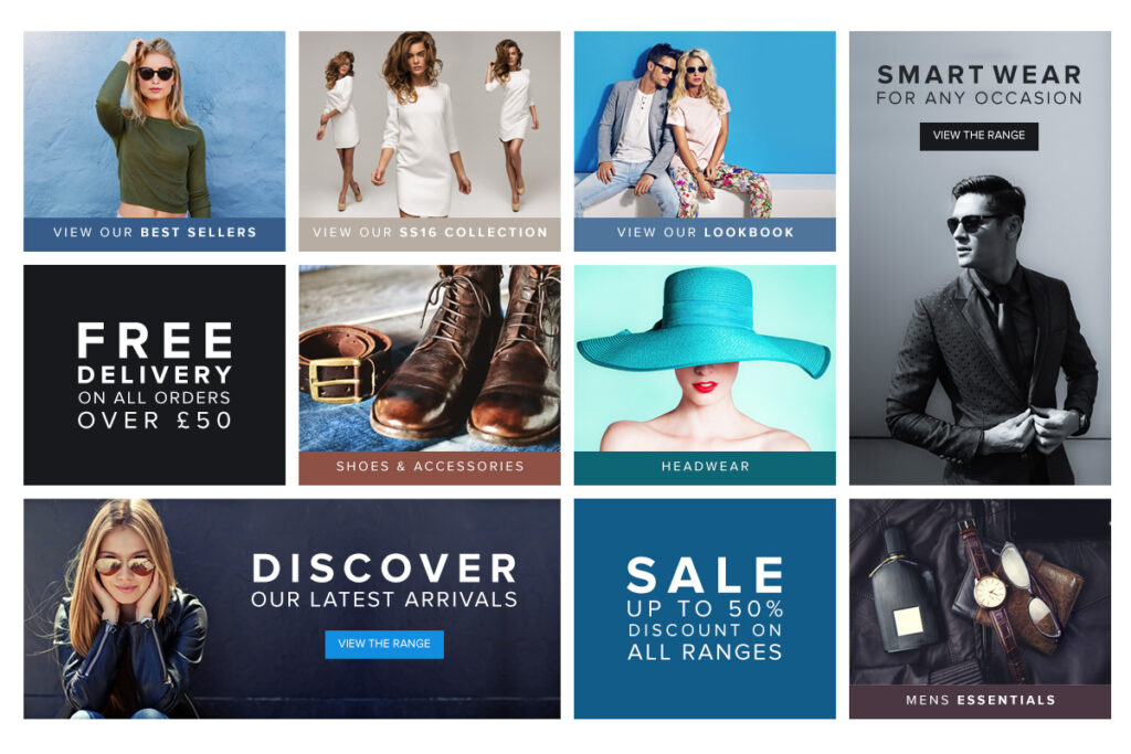
Offering a choice of template-driven designs which are fully customizable, Cloudfy offers you the full capability to change color, font, style and manage all content and banners across desktop, tablet and mobile devices, so you can easily convey your brand image via your new ecommerce store. A key feature is that a Cloudfy website is as usable on a mobile device as it is on a PC and with mobile traffic growing at a rapid pace, this will allow you to not miss out on an important traffic segment.
Furthermore, as part of our Enterprise Plan, we also offer extended 1600px ultra-wide design using the latest responsive technology, which is perfect if you want to make use of large screens to their full potential. This also allows you to showcase 5 products across in product categories instead of 3.
But that’s not all! while at the moment Cloudfy customers can use from a series of predetermined website design templates, according to their preferred plan, Cloudfy can also be used to create bespoke websites, such as the recent launch of fashion designer Lou Dalton’s new website. Furthermore, one of the planned features for the Cloudfy platform includes being able to offer even more flexibility when it comes to choosing your website design, which will be done based on a drag and drop technique which will allow you to build your website design by selecting preferred elements.
To find out more about Cloudfy’s fantastic ecommerce features contact us today.